
Key Features
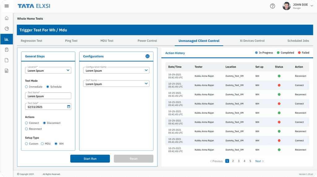
• Streamlined Navigation: Our new layout ensures effortless test execution and report viewing.
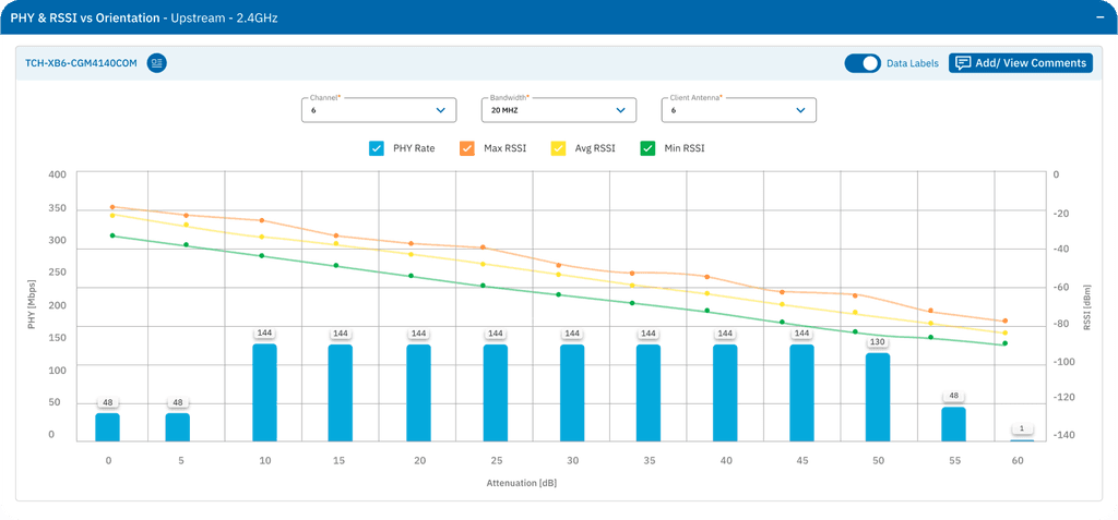
• Effective Data Visualisation: Interactive graphs and charts clearly present test results for quick understanding.
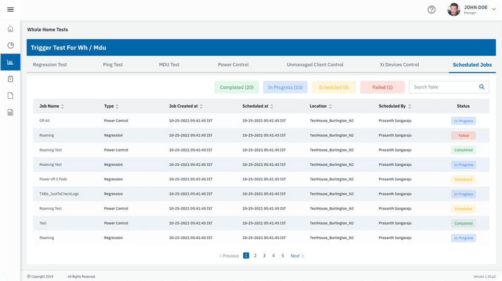
• Enhanced Table Features: Enjoy powerful sorting, filtering, and pagination for easy access to your data.
• Dynamic Form Design: Grouped input fields, real-time validation, and organised layouts enhance the user experience.
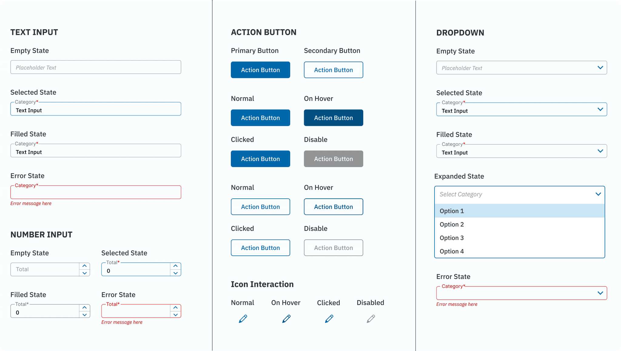
• Unified Design System: Standardised components guarantee clarity and scalability throughout the interface.
My Role: UI Designer
During the visual design and prototyping stage, I played a key role in leading the efforts to develop a user interface that prioritizes clarity and ease of use. My responsibilities included, but were not limited to, the following:
• Turned low-fidelity wireframes into detailed high-fidelity user interface designs.
• Built interactive prototypes for user testing and feedback.
• Created and updated a design system to maintain consistency and make it easy to scale.
• Worked closely with developers to ensure smooth implementation of the design.
TEAM COMPOSITION
PROJECT KICKOFF
• Conducted meetings with the client (users) and developers to understand the existing tool and its challenges.
• Participated in a walkthrough of the tool to grasp technical aspects and functionality.
USER INTERVIEWS
• Engaged with QA testers during each sprint to uncover pain points and gather insights specific to the page being designed.
• Iterative feedback loops throughout sprints.
SPRINT-BASED APPROACH
• Each page was assigned to a sprint, with durations of 2–3 weeks depending on complexity.
• Weekly client meetings ensured iterative progress and timely feedback.
SPRINT WORKFLOW
• Week 1: Presented low-fidelity wireframes for user review and feedback.
• Week 2: Delivered high-fidelity prototypes for discussion and approval.
• End of Sprint: Finalized and handed over screens to the development team for implementation.
DESIGN SYSTEM UPDATES
Continuously refined and expanded the design system to maintain consistency and scalability throughout the tool.
Research Methods: Client Interviews – to identify the challenges associated with the current tool.
User Pain Points & Design Solutions
Time-Consuming Form Fields & Difficult Page Scanning
Challenge:
Users reported that the zig-zag pattern of form fields disrupted the flow, making it time-consuming and challenging to navigate through the pages.
Solution:
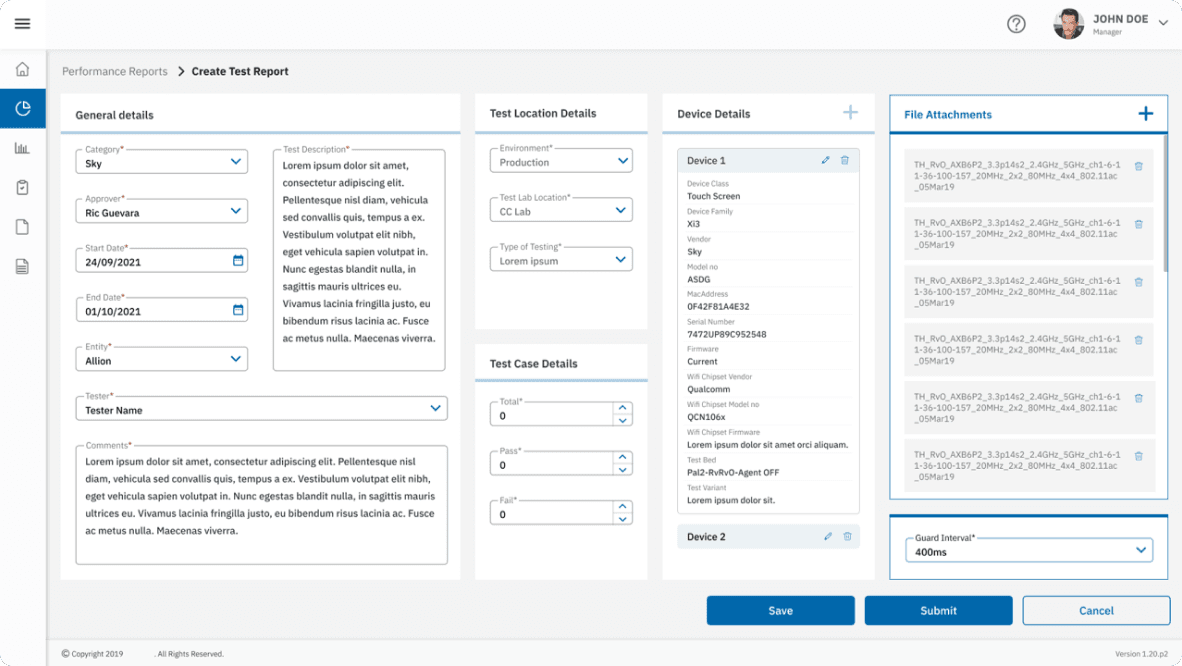
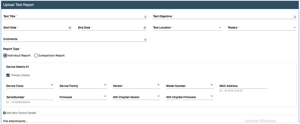
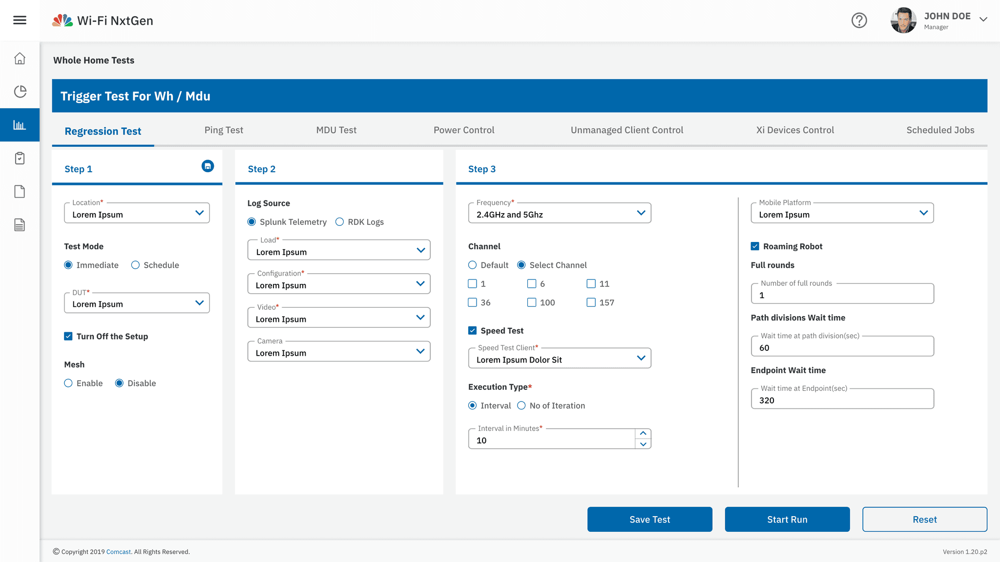
• Grouped related fields into side-by-side cards to create a logical flow and reduce completion time.
• Step-by-step progression: The first card (general details) is active by default, with subsequent cards unlocking only after completing the current one.
Excessive Scrolling & Poor Space Optimization
Challenge:
Excessive scrolling made table visualisation hard to read. Inefficient use of space led to scattered and disconnected layouts, reducing page optimisation. The lack of accessibility features further impacted the user experience.
Solution:
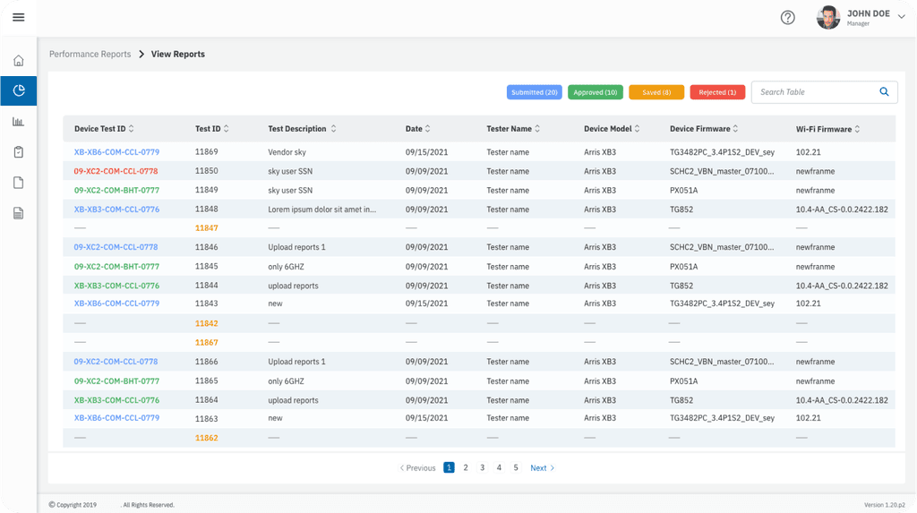
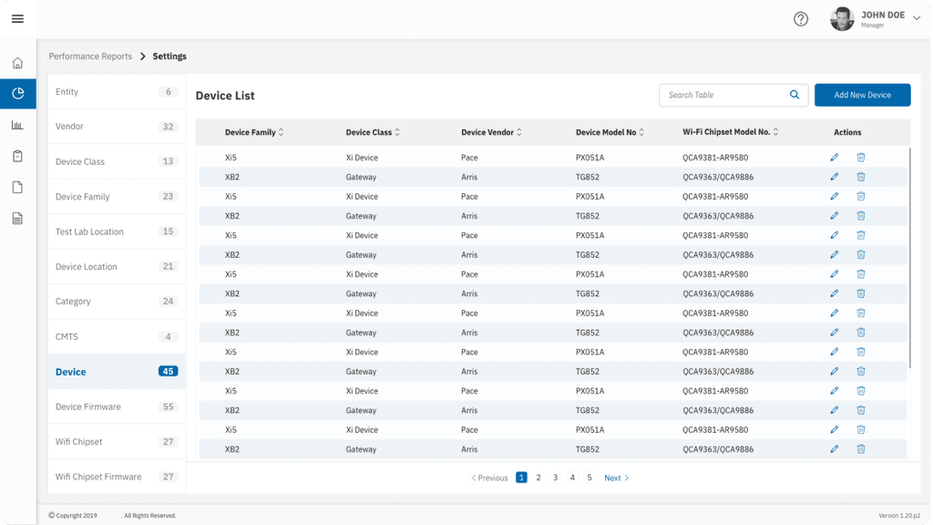
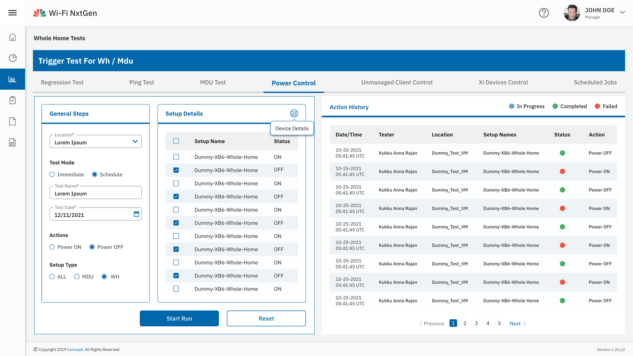
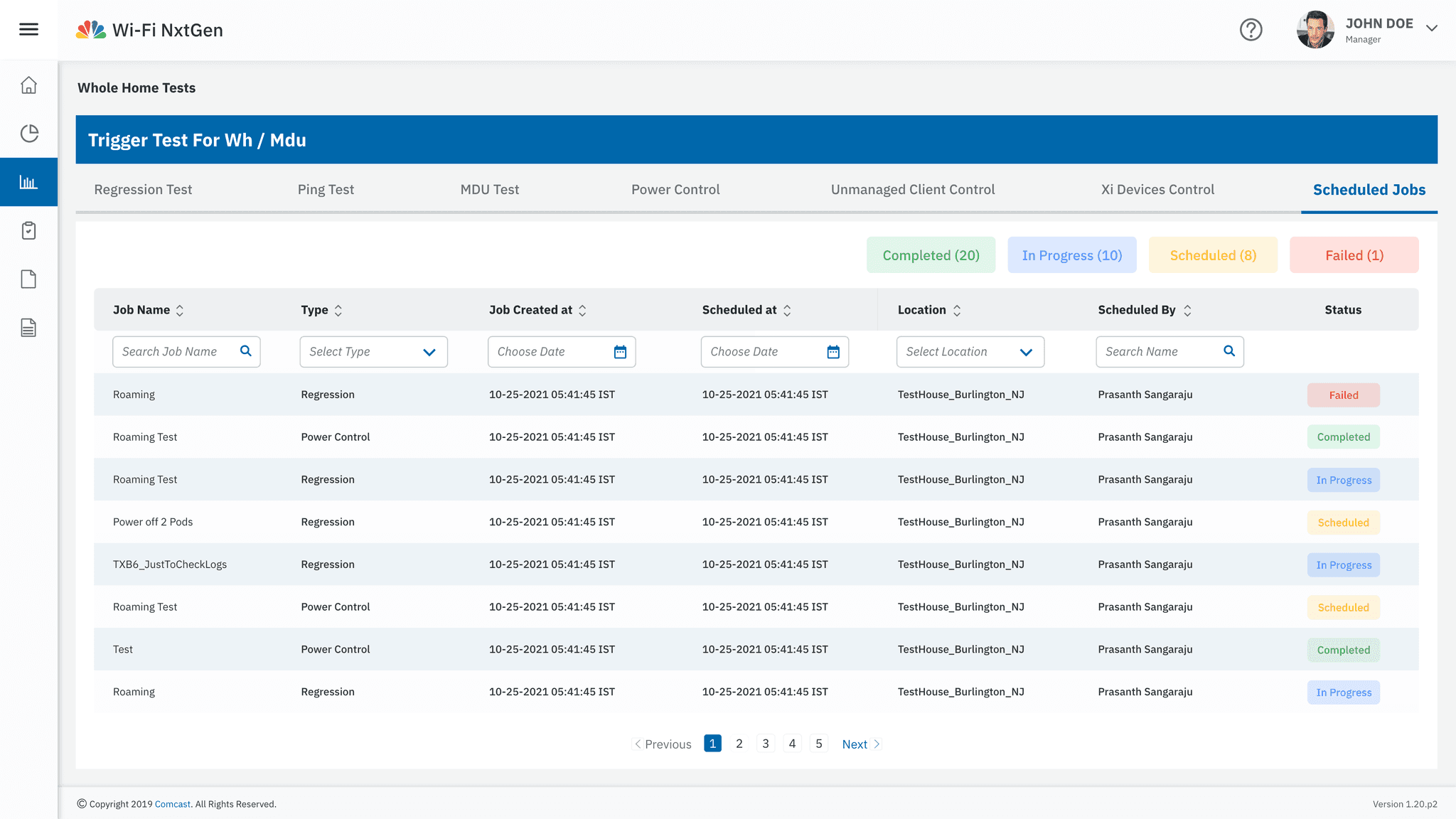
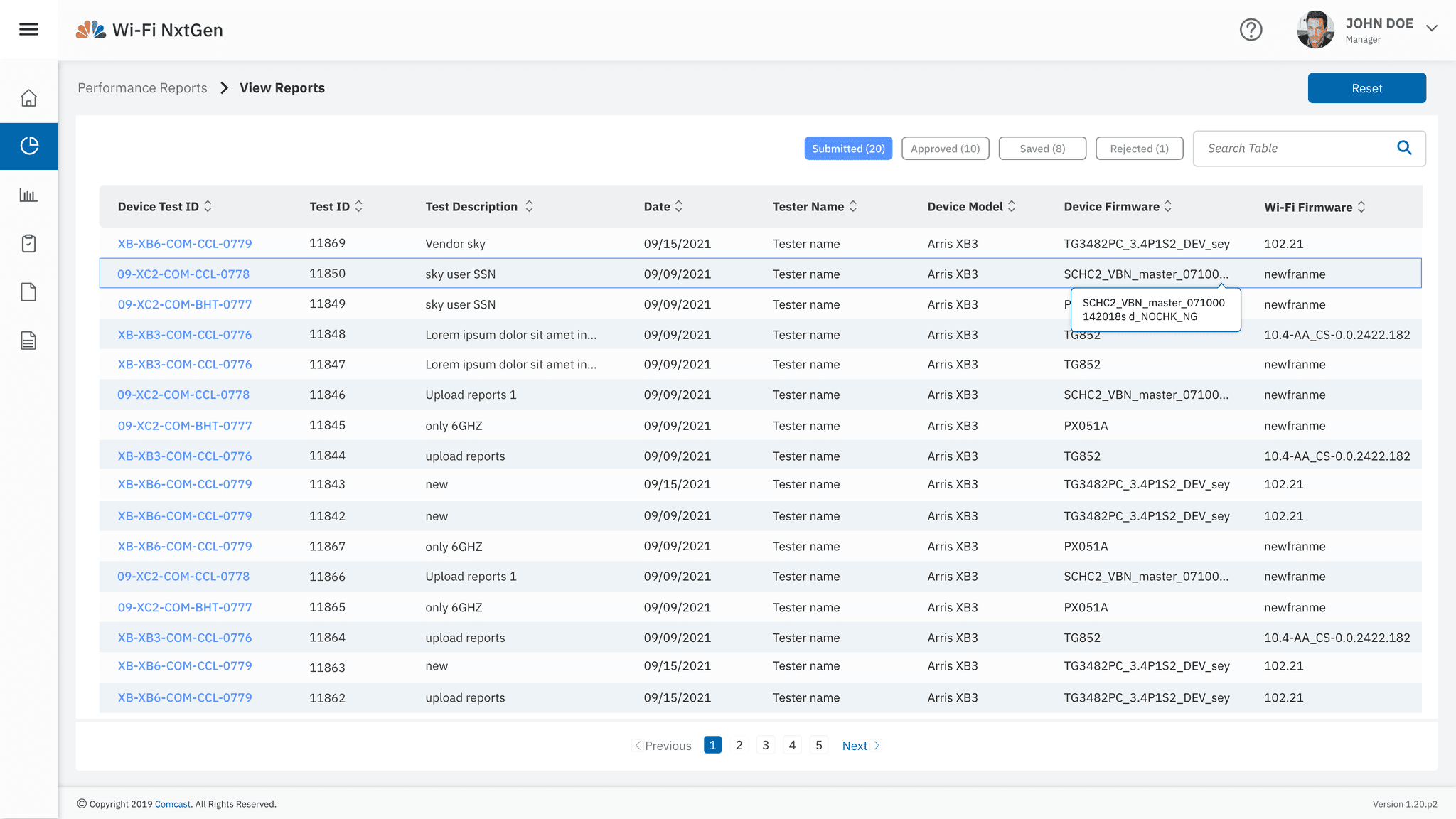
• Smaller row height for tables: Adjusted the row height to display more rows, reducing the need for scrolling and allowing users to view more data at a glance.
• Efficient use of white space: Improved layout consistency and ensured an optimised, cohesive design.
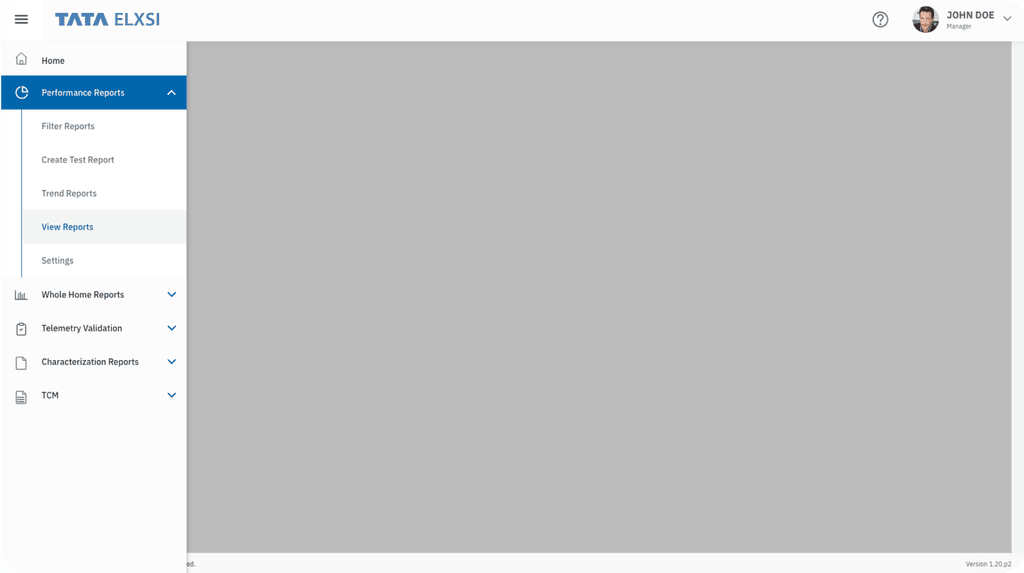
• Accordion list redesign: Transformed the accordion list into a side menu, with table content for each menu category displayed on the right for easier navigation and access.
Hard-to-Read Data Due to Poor Use of Colours and Contrast
Challenge:
Users struggled to interpret data because of low contrast and ineffective colour usage.
Solution:
• Adopted a WCAG-compliant colour palette to enhance readability.
• Improved the visual hierarchy using contrasting colours and typographic differentiation for key data points.
• Integrated hover interactions and tooltips for additional context, making complex data easier to understand.
Forms & Input Design
• Grouped fields into logical sections.
• Progressive disclosure for better guidance.
• Real-time validation & error handling.
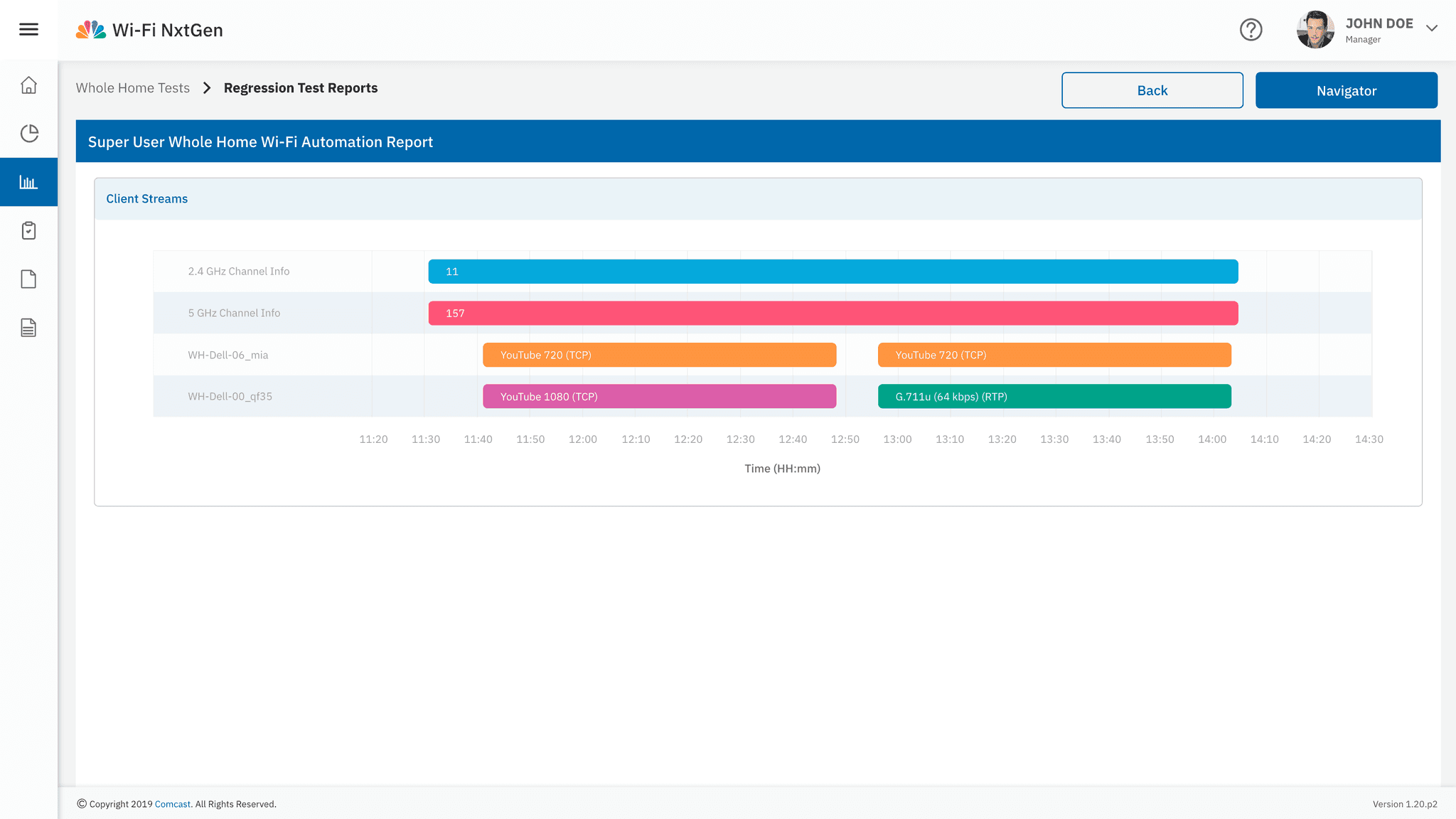
Tables & Data Management
• Optimised row height for better readability.
• Filters, sorting, and pagination for easy navigation.
• Hover effects & interactive table actions.
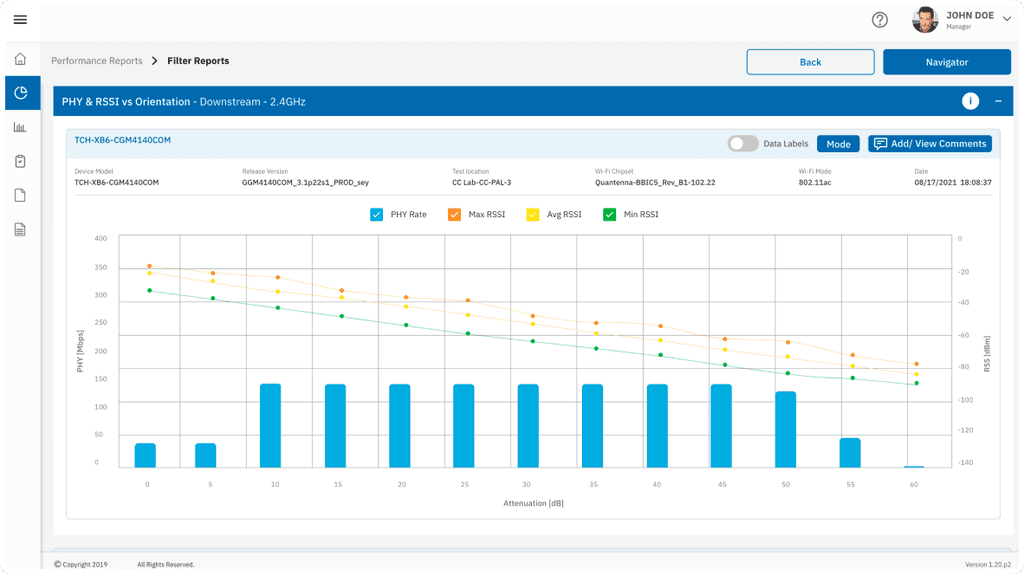
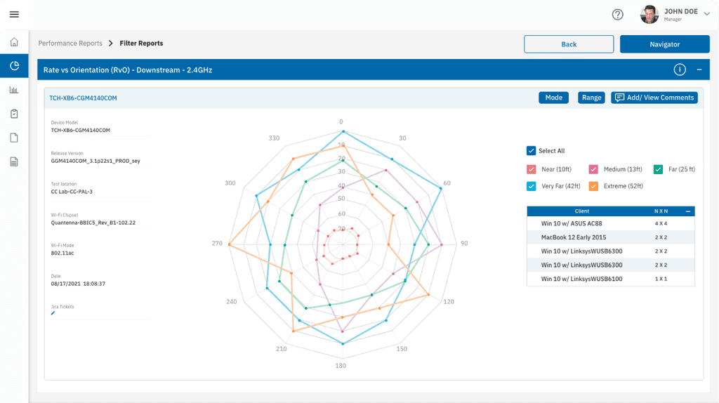
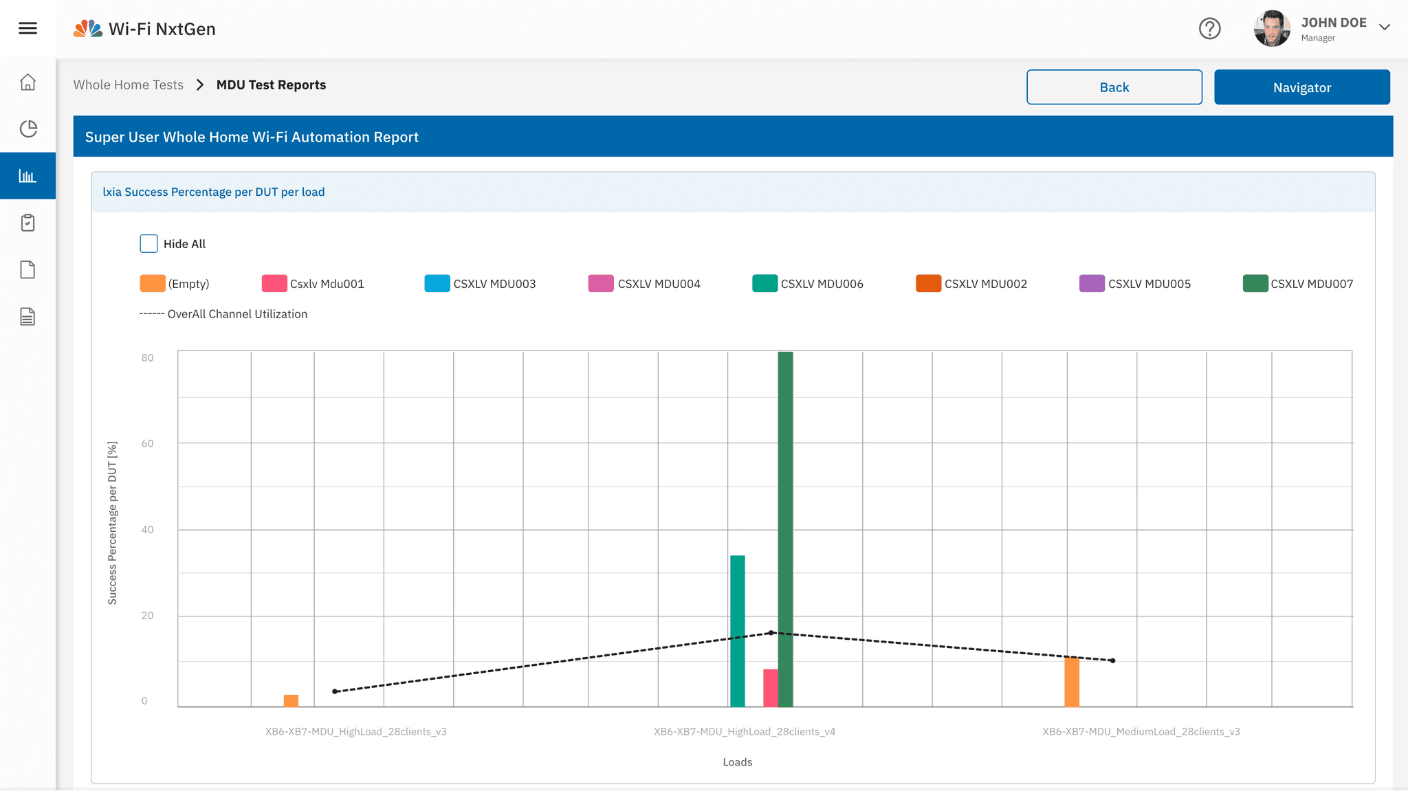
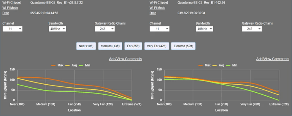
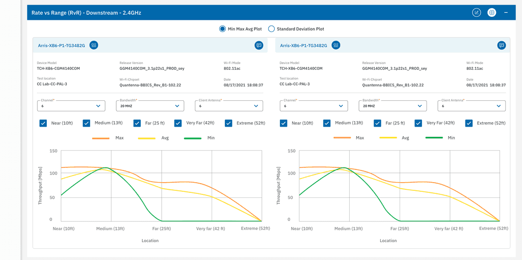
Data Visualization
• Clear navigation for switching between different graphs.
• Various graph types (bar charts, line graphs, etc.
• Hover interactions & tooltips for better insights.